Components
Depending on the complexity of your software, you may need to split your project into several components. Components are a bundle of folders and associated installation logic.
They are able to execute actions (include Action Lists), copy files and prompt the user for data (display Parameters), as the project does:
<component>
    <name>component</name>
    <description>component</description>
    <detailedDescription>This is a component</detailedDescription>
    <initializationActionList>
        <setInstallerVariable name="my_variable" value="1" />
    </initializationActionList>
    <parameterList>
        <booleanParameter>
            <name>boolean_question</name>
            <title>Boolean Question</title>
            <description>Please answer yes or no</description>
        </booleanParameter>
    </parameterList>
    <folderList>
        <folder>
            <description>Program Files</description>
            <destination>${installdir}</destination>
            <name>programfiles</name>
            <platforms>all</platforms>
            <distributionFileList>
                <distributionDirectory origin="program" />
            </distributionFileList>
        </folder>
    </folderList>
</component>
The ability to enable / disable components at build time and runtime allows your installer to provide as many setup combinations as you need.
The basic properties you should configure when adding a component are:
-
<name>: Name of the Component. This name must be unique and just contain alphanumeric characters and underscores. -
<description>: Description of the Component. This description will be included in the list of the visible components presented to the user. -
<detailedDescription>: A detailed description of the component. This detailed description will be displayed when clicking in the component description in the component selection page. -
<selected>: Whether or not the component is selected. If the component is not selected, its action lists won’t be executed and its folders won’t be unpacked. -
<show>: Whether or not the component is visible in the component selection page. -
<canBeEdited>: Whether or not the component can be edited in the component selection page. -
<requiredSize>: Required disk space in the target system. If 0, then it will automatically be calculated based on the size of the packed files. The sum of the sizes of all of the installed components can be later accessed through the built-in variable${required_diskspace}.
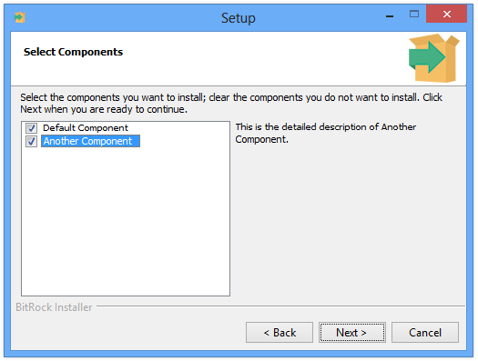
Components are defined in the project <componentList> and presented to the end user as in the Figure 23:
As mentioned above, depending on the value of <show>, the component will be visible or not, and if so, the <canBeEdited> property will decide if the user will be able to select and deselect it.
The example below illustrates some of the possible combinations when including components:
<project>
    ...
    <!-- Shows the component selection page -->
    <allowComponentSelection>1</allowComponentSelection>
    ...
    <componentList>
        <!-- Main base component, it must be always
        installed. We hide it  -->
        <component>
            ...
            <name>main</name>
            <selected>1</selected>
            <show>0</show>
            ...
        </component>
        ...
        <!-- Important required component. We show it
        in the component selection but made it mandatory
        to install -->
        <component>
            ...
            <name>core</name>
            <description>Core product</description>
            <detailedDescription>This is the base of the application.</detailedDescription>
            <selected>1</selected>
            <show>1</show>
            <canBeEdited>0</canBeEdited>
            ...
        </component>
        ...
        <!-- Optional Useful Component. We allow deselecting it but we suggest it
        by default setting show=1 -->
        <component>
            ...
            <name>docs</name>
            <description>Documentation</description>
            <detailedDescription>Documentation of the product</detailedDescription>
            <selected>1</selected>
            <show>1</show>
            <canBeEdited>1</canBeEdited>
            ...
        </component>

        <!-- Additional Optional Component. It is not very important so
        we do not include it by default (show=0)  -->
        <component>
            ...
            <name>extra</name>
            <description>Extra files</description>
            <detailedDescription>Extra files including images
            and translation files</detailedDescription>
            <selected>0</selected>
            <show>1</show>
            <canBeEdited>1</canBeEdited>
            ...
        </component>
    </componentList>
    ...
</project>
Please note that the code also enables <allowComponentSelection>1</allowComponentSelection>. This setting makes the component selection page (which is hidden by default) visible to the end user.
Enabling and disabling components
The easiest way of configuring if a component will be selected or not is by modifying its <selected> property:
<componentList>
   <!-- This component is selected -->
   <component>
     ...
     <name>component1</name>
     ...
     <selected>1</selected>
     ...
   </component>
   <!-- This component is not selected -->
   <component>
     ...
     <name>component2</name>
     ...
     <selected>0</selected>
     ...
   </component>
</componentList>
However, in most of the cases you will need to decide whether to select or not components at runtime, based on certain conditions. For this purpose, InstallBuilder includes a <componentSelection> action. For example, if you detect and existing installation of your product, you may want to deselect your core component and select the update component:
<project>
  ...
  <componentList>
    <component>
      <name>core</name>
      ...
      <selected>1</selected>
      ...
    </component>
    <component>
      <name>update</name>
      ...
      <selected>0</selected>
      ...
    </component>
  </componentList>
  <readyToInstallActionList>
     <componentSelection>
        <deselect>core</deselect>
        <select>update</select>
        <ruleList>
           <fileExists path="${installdir}/wellKnown/file"/>
        </ruleList>
     </componentSelection>
  </readyToInstallActionList>
  ...
</project>
The <componentSelection> action also accepts multiple components to select or deselect, separated by commas, in its <deselect> and <select> tags. This way you can change the behavior of the installer with a single action.
The code below explains how to prompt the user to select between a minimal (core components), standard (core and useful components) and full installation (also include documentation and videos):
<project>
  ...
  <allowComponentSelection>0</allowComponentSelection>
  ...
  <componentList>
    <component>
      <name>core</name>
      ...
    </component>
    <component>
      <name>xmlEditor</name>
      ...
    </component>
    <component>
      <name>debugger</name>
      ...
    </component>
    <component>
      <name>documentation</name>
      ...
    </component>
    <component>
      <name>videos</name>
      ...
    </component>
  </componentList>
  ...
  <parameterList>
     <choiceParameter>
        <name>installationMode</name>
        <ask>1</ask>
        <default>normal</default>
        <description>Please select the installation mode</description>
        <title>Installation Mode</title>
        <optionList>
           <option>
             <value>minimal</value>
             <text>Minimal</text>
           </option>
           <option>
             <value>standard</value>
             <text>Standard</text>
           </option>
           <option>
             <value>full</value>
             <text>Full</text>
           </option>
        </optionList>
        <postShowPageActionList>
           <componentSelection>
              <deselect>xmlEditor,debugger,documentation,videos</deselect>
              <select>core</select>
              <ruleList>
                 <compareText>
                   <text>${installationMode}</text>
                   <logic>equals</logic>
                   <value>minimal</value>
                 </compareText>
              </ruleList>
           </componentSelection>
           <componentSelection>
              <deselect>documentation,videos</deselect>
              <select>core,xmlEditor,debugger</select>
              <ruleList>
                 <compareText>
                   <text>${installationMode}</text>
                   <logic>equals</logic>
                   <value>standard</value>
                 </compareText>
              </ruleList>
           </componentSelection>
           <componentSelection>
              <deselect></deselect>
              <select>core,xmlEditor,debugger,documentation,videos</select>
              <ruleList>
                 <compareText>
                   <text>${installationMode}</text>
                   <logic>equals</logic>
                   <value>full</value>
                 </compareText>
              </ruleList>
           </componentSelection>
        </postShowPageActionList>
     </choiceParameter>
  </parameterList>
  ...
</project>
You can also check the state of a component using the <componentTest> rule:
<throwError>
  <text>You cannot install 'Component A' and 'Component B' at the same time!</text>
  <ruleList>
     <componentTest name="componentA" logic="selected"/>
     <componentTest name="componentB" logic="selected"/>
  </ruleList>
</throwError>
By enabling the <checkParentComponents> property of <componentTest> it’s possible to check if a sub-component and all of its parents are selected.
 <fileParameter>
     <name>apacheconfig</name>
     <title>Configuring Apache</title>
     <explanation>Please specify the location of the Apache configuration file</explanation>
     <description>Apache Configuration File</description>
     <ruleList>
        <componentTest>
            <logic>selected</logic>
            <name>apache</name>
            <checkParentComponents>true</checkParentComponents>
        </componentTest>
    </ruleList>
 </fileParameter>
Another way of selecting or deselecting a component is to directly modify the <selected> property using the <setInstallerVariable> action as explained in the Advanced Syntax section:
<setInstallerVariable name="project.component(core).selected" value="0"/>The same way, you can check if a component is selected (or any other of its properties):
<directoryParameter>
   <name>installdir</name>
   <validationActionList>
      <actionGroup>
         <actionList>
            <getFreeDiskSpace path="${installdir}" units="KB" variable="diskSpace"/>
            <throwError>
              <text>You don't have enough disk space to install
              ${project.component(bigComponent).description}</text>
              <ruleList>
                <compareValues>
                  <value1>${project.component(bigComponent).requiredSize}</value1>
                  <logic>greater</logic>
                  <value2>${diskSpace}</value2>
                </compareValues>
              </ruleList>
            </throwError>
         </actionList>
         <ruleList>
           <isTrue value="${project.component(bigComponent).selected}"/>
         </ruleList>
      </actionGroup>
   </validationActionList>
</directoryParameter>
Finally, visible and editable components can also be selected and deselected using the command line:
$> /path/to/installer --disable-components windowsdata,unixdata --enable-components osxdataWhere --disable-components and --enable-components accept a comma-separated list of components. Only visible components (<show>1</show>) will be displayed in the help menu and only those which are also editable (<canBeEdited>1</canBeEdited>) will be configurable using these flags. For example, if your project has the component list below:
 <componentList>
    <!-- Main base component, it must be always
    installed. We hide it  -->
    <component>
       ...
       <name>main</name>
       <selected>1</selected>
       <show>0</show>
       ...
    </component>
    ...
    <!-- Important required component. We show it
    in the component selection but made it mandatory
    to install -->
    <component>
       ...
       <name>core</name>
       <description>Core product</description>
       <selected>1</selected>
       <show>1</show>
       <canBeEdited>0</canBeEdited>
       ...
    </component>
    ...
    <!-- Optional Useful Component. We allow deselecting it but we suggest it
    by default setting show=1 -->
    <component>
       ...
       <name>docs</name>
       <selected>1</selected>
       <show>1</show>
       <canBeEdited>1</canBeEdited>
       ...
    </component>
    <!-- Additional Optional Component. It is not very important so
    we do not include it by default (show=0)  -->
    <component>
       ...
       <name>extra</name>
       <selected>0</selected>
       <show>1</show>
       <canBeEdited>1</canBeEdited>
       ...
    </component>
 </componentList>
The output in the help menu will be:
 --enable-components <enable-components> Comma-separated list of components
                                Default: core,docs
                                Allowed: docs extra

 --disable-components <disable-components> Comma-separated list of components
                                Default: extra
                                Allowed: docs extra
In this output, main is not mentioned, as it was configured as hidden, and just docs and extra are allowed values, as core was configured as a non-editable component and always selected.
These command line options are only available if <allowComponentSelection> is enabled.
|
Note
|
Only the hardcoded state of the components is considered when displaying the help menu.
As the help menu is completely independent from regular action lists, even if you are changing the components properties in the Will result in an empty list of components in the help menu: --enable-components <enable-components> Comma-separated list of components
Default:
--disable-components <disable-components> Comma-separated list of components
Default:
But all of them will be visible and editable in the graphical component selection. |
|
Note
|
The
<selected> property cannot contain variablesThe component If you need to bind a boolean variable to the |
Component Action Lists
Components can include all of the Action Lists available for the main project with the exception of the <preShowHelpActionList> and the <finalPageActionList.
In addition, components include a few new action lists:
Component Selection Validation Actions
The <componentSelectionValidationActionList> is executed right after clicking Next in the component selection page and allows checking if the provided component configuration is valid. It works the same way as the <validationActionList>; if an error is thrown inside it, instead of aborting the installation, the error message is displayed and the page redrawn.
This is really useful when implementing dependencies between components:
<project>
    ...
    <allowComponentSelection>1</allowComponentSelection>
    ...
    <componentList>
      <component>
        ...
        <name>A</name>
        ...
      </component>
      <component>
        ...
        <name>B</name>
        ...
      </component>
      <component>
        <name>C</name>
        <description>Component C</description>
        <detailedDescription>This component depends on 'A' and 'B'</detailedDescription>
        ...
        <componentSelectionValidationActionList>
          <throwError>
            <text>Component 'C' cannot be installed if you have not selected both 'A' and 'B'.</text>
            <ruleList>
              <isFalse value="${component(A).selected}"/>
              <isFalse value="${component(B).selected}" />
            </ruleList>
          </throwError>
        </componentSelectionValidationActionList>
        ...
      </component>
      ...
    </componentList>
    ...
</project>
The <componentSelectionValidationActionList> is only executed when the component selection page is displayed and the component defining the validation is selected (regardless of whether or not it is visible). This could be an issue if, for example, you need to validate that at least one of two optional components are selected and if the user deselects them, none of the validations will be executed. In these cases, you can use a hidden component, just used to validate the others:
How to establish dependencies between components
<project>
    ...
    <allowComponentSelection>1</allowComponentSelection>
    ...
    <componentList>
      <component>
        ...
        <name>A</name>
        ...
      </component>
      <component>
        ...
        <name>B</name>
        ...
      </component>
      <component>
        <name>validatorComponent</name>
        <selected>1</selected>
        <show>0</show>
        ...
        <componentSelectionValidationActionList>
          <throwError>
            <text>You have to select at least one component.</text>
            <ruleList>
              <isFalse value="${component(A).selected}"/>
              <isFalse value="${component(B).selected}" />
            </ruleList>
          </throwError>
        </componentSelectionValidationActionList>
        ...
      </component>
      ...
    </componentList>
    ...
</project>
On Download Error Actions
If the component was marked as <downloadable> and the installer was built accordingly (check the Downloadable components section for more details), the <onDownloadErrorActionList> allows providing a set of of actions to execute if the download process fails and the user decides to ignore it.
This allows properly recovering from the error, for example, deselecting other components that depend on it.
Adding files and directories
Components can also contain a list of <folder> elements, which are mainly used to define files to pack:
<component>
   ...
   <name>default</name>
   ...
   <folderList>
     <!-- The installation directory -->
     <folder>
        <name>programfiles</name>
        <description>Program Files</description>
        <destination>${installdir}</destination>
        <platforms>all</platforms>
        <distributionFileList>
          <distributionFile>
            <origin>/path/to/file.txt</origin>
          </distributionFile>
          ...
          <distributionDirectory>
            <origin>/path/to/directory</origin>
          </distributionDirectory>
          ...
        </distributionFileList>
     </folder>

     <!-- Configuration files that should be installed inside
     /etc, and for linux only -->
     <folder>
        <name>linuxconfigfiles</name>
        <description>Linux Configuration Files</description>
        <destination>/etc</destination>
        <platforms>linux</platforms>
        <distributionFileList>
           ...
        </distributionFileList>
     </folder>
   </folderList>
   ...
</component>
The next section explains in detail how to work with folders.
Adding shortcuts to the components
Each component has three shortcut lists which can be used to create shortcuts:
-
<desktopShortcutList>: Shortcuts to be placed in the Desktop. Its available shortcuts are:<shortcut>,<linkShortcut>and<fileShortcut>
 <component>
   <name>default</name>
   ...
   <desktopShortcutList>
     <!-- Intended to launch an application -->
     <shortcut>
        <comment>Launch My Program</comment>
        <exec>${installdir}/bin/myprogram</exec>
        <icon></icon>
        <name>My Program</name>
        <path>${installdir}/bin</path>
        <platforms>all</platforms>
        <runInTerminal>0</runInTerminal>
        <windowsExec>${installdir}/bin/myprogram.exe</windowsExec>
        <windowsExecArgs></windowsExecArgs>
        <windowsIcon></windowsIcon>
        <windowsPath>${installdir}/bin</windowsPath>
     </shortcut>

     <!-- Intended to launch a web browser pointing to a specific url -->
     <linkShortcut>
        <comment>Launch a web browser pointing to My Program website</comment>
        <icon></icon>
        <name>Visit My Program website</name>
        <platforms>all</platforms>
        <runInTerminal>0</runInTerminal>
        <url>http://www.example.com/myprogram</url>
        <windowsIcon></windowsIcon>
     </linkShortcut>

     <!-- Intended to launch a viewer for a specific file -->
     <fileShortcut>
        <comment>Check the user guide</comment>
        <filePath>${installdir}/doc/userguide.pdf</filePath>
        <icon></icon>
        <name>My Program User Guide</name>
        <platforms>all</platforms>
        <runInTerminal>0</runInTerminal>
        <windowsIcon></windowsIcon>
     </fileShortcut>
     ...
   </desktopShortcutList>
   ...
</component>-
<startMenuShortcutList>: Link to applications, documents or URL for the Windows Start menu. Its available shortcuts are:<startMenuShortcut>,<startMenuLinkShortcut>and<startMenuFileShortcut>:
 <component>
   <name>default</name>
   ...
   <startMenuShortcutList>
     <!-- Intended to launch an application -->
     <startMenuShortcut>
        <comment>Launch My Program</comment>
        <exec>${installdir}/bin/myprogram</exec>
        <icon></icon>
        <name>My Program</name>
        <path>${installdir}/bin</path>
        <platforms>all</platforms>
        <runInTerminal>0</runInTerminal>
        <windowsExec>${installdir}/bin/myprogram.exe</windowsExec>
        <windowsExecArgs></windowsExecArgs>
        <windowsIcon></windowsIcon>
        <windowsPath>${installdir}/bin</windowsPath>
     </startMenuShortcut>

     <!-- Intended to launch a web browser pointing to a specific url -->
     <startMenuLinkShortcut>
        <comment>Launch a web browser pointing to My Program website</comment>
        <icon></icon>
        <name>Visit My Program website</name>
        <platforms>all</platforms>
        <runInTerminal>0</runInTerminal>
        <url>http://www.example.com/myprogram</url>
        <windowsIcon></windowsIcon>
     </startMenuLinkShortcut>

     <!-- Intended to launch a viewer for a specific file -->
     <startMenuFileShortcut>
        <comment>Check the user guide</comment>
        <filePath>${installdir}/doc/userguide.pdf</filePath>
        <icon></icon>
        <name>My Program User Guide</name>
        <platforms>all</platforms>
        <runInTerminal>0</runInTerminal>
        <windowsIcon></windowsIcon>
     </startMenuFileShortcut>
     ...
   </startMenuShortcutList>
   ...
</component>|
Note
|
Why are uninstaller Start Menu shortcuts removed on Windows 10?
Windows 10 automatically removes the uninstaller Start Menu shortcuts to reduce clutter. You can find additional details in this article. |
-
<quickLaunchShortcutList>: Shortcuts to be placed in the Windows Quick Launch toolbar. Its available shortcuts are:<startMenuShortcut>,<startMenuLinkShortcut>and<startMenuFileShortcut>:
 <component>
   <name>default</name>
   ...
   <quickLaunchShortcutList>
     <!-- Intended to launch an application -->
     <quickLaunchShortcut>
        <comment>Launch My Program</comment>
        <exec>${installdir}/bin/myprogram</exec>
        <icon></icon>
        <name>My Program</name>
        <path>${installdir}/bin</path>
        <platforms>all</platforms>
        <runInTerminal>0</runInTerminal>
        <windowsExec>${installdir}/bin/myprogram.exe</windowsExec>
        <windowsExecArgs></windowsExecArgs>
        <windowsIcon></windowsIcon>
        <windowsPath>${installdir}/bin</windowsPath>
     </quickLaunchShortcut>

     <!-- Intended to launch a web browser pointing to a specific url -->
     <quickLaunchLinkShortcut>
        <comment>Launch a web browser pointing to My Program website</comment>
        <icon></icon>
        <name>Visit My Program website</name>
        <platforms>all</platforms>
        <runInTerminal>0</runInTerminal>
        <url>http://www.example.com/myprogram</url>
        <windowsIcon></windowsIcon>
     </quickLaunchLinkShortcut>

     <!-- Intended to launch a viewer for a specific file -->
     <quickLaunchFileShortcut>
        <comment>Check the user guide</comment>
        <filePath>${installdir}/doc/userguide.pdf</filePath>
        <icon></icon>
        <name>My Program User Guide</name>
        <platforms>all</platforms>
        <runInTerminal>0</runInTerminal>
        <windowsIcon></windowsIcon>
     </quickLaunchFileShortcut>
     ...
   </quickLaunchShortcutList>
   ...
 </component>
Adding components from external files
Components can also be extracted to a different file, making them usable as modules between different projects. These external files can be later inserted in the <componentList> using the <include> directive as seen in the code below:
<componentList>
    <include file="my_external_component.xml" />
</componentList>
Of course, you can mix external and internal components in the project file
<componentList>
    <component>
        <name>internal</name>
    </component>
    <include file="my_external_component.xml" />
</componentList>
In fact, the <include> directive can be used to include any external piece of XML code in any place of the project if some conditions are met:
-
The parent XML node is a
<*List>tag:<actionList>,<parameterList>,<ruleList>… -
The inserted code is valid in the insertion point. For example, trying to include a file containing a
<showInfo>action in a<ruleList>will fail. -
The inserted XML code is grouped in a single element. For example, inserting a code containing two
<runProgram>actions will fail but inserting an<actionGroup>with multiple actions on it will work.
<project>
    <shortName>sample</shortName>
    <fullName>Sample Project</fullName>
    <version>1.0</version>
    <enableRollback>1</enableRollback>
    <enableTimestamp>1</enableTimestamp>
    <componentList>
        <!-- component.xml contains a component -->
        <include file="path/to/component.xml"/>
        <component>
            <name>default</name>
            <description>Default Component</description>
            <canBeEdited>1</canBeEdited>
            <selected>1</selected>
            <show>1</show>
            <folderList>
              <!-- folder.xml contains a folder -->
              <include file="path/to/folder.xml"/>
            </folderList>
        </component>
    </componentList>
    <parameterList>
        <!-- installdir.xml contains a directory parameter -->
        <include file="path/to/installdir.xml"/>
        <booleanParameter>
            <name>boolean_question</name>
            <title>Boolean Question</title>
            <description>Please answer yes or no</description>
            <validationActionList>
               <!-- validationActions.xml contains an actionGroup -->
               <include file="path/to/validationActions.xml"/>
               <throwError text="You must click yes!" >
                  <ruleList>
                     <!-- isTrue.xml contains a set of rules in a ruleGroup -->
                     <include file="path/to/isTrue.xml"/>
                  </ruleList>
               </throwError>
            </validationActionList>
        </booleanParameter>
       ...
    </parameterList>
    ...
</project>Excluding components at build time
Although a component can be disabled and hidden at runtime by modifying its <selected> and <show> properties, sometimes it is desirable to do not bundle them at all. In these situations, you can use the <shouldPackRuleList>. This set of rules is evaluated at build time and will decide whether or not the component containing them will be packed. For example, to just pack a component when building for OS X:
   <component>
       <name>osxComponent</name>
       <description>OS X Component</description>
       <canBeEdited>1</canBeEdited>
       <selected>1</selected>
       <show>1</show>
       ...
       <shouldPackRuleEvaluationLogic>and</shouldPackRuleEvaluationLogic>
       <shouldPackRuleList>
           <compareText>
               <logic>equals</logic>
               <text>${platform_name}</text>
               <value>osx</value>
           </compareText>
       </shouldPackRuleList>
   </component>
Please note the usage of the built-in variable ${platform_name}, which contains the build target at build time. In this case, using a <platformTest> will not work because it would evaluate the platform in which the builder is running and not the platform for which the installer is being built.
The same way as a <ruleList>, the <shouldPackRuleList> can contain <ruleGroup> rules to create complex conditions. You can also configure its rule evaluation logic using the <shouldPackRuleEvaluationLogic> property.
Component Groups
A <componentGroup> is a special type of <component> that can contains other components in its <componentList>:
<project>
...
<componentList>
<!-- componentGroup, a component with sub-components -->
<componentGroup>
<name>application1</name>
<description>Application 1</description>
...
<folderList>
...
</folderList>
<componentList>
<component>
<name>feature1</name>
<description>Optional feature 1</description>
<folderList>
...
</folderList>
</component>
<component>
<name>feature2</name>
<description>Optional feature 2</description>
<folderList>
...
</folderList>
</component>
<!-- embedding a group inside a group -->
<componentGroup>
<name>feature3</name>
<description>Optional feature 3</description>
<componentList>
<component>
<name>feature4</name>
<description>Optional feature 4</description>
<folderList>
...
</folderList>
</component>
</componentList>
<folderList>
...
</folderList>
</componentGroup>
</componentList>
</componentGroup>
<component>
<name>application2</name>
<description>Application 2</description>
<folderList>
...
</folderList>
</component>
<!-- component group that is always selected and cannot be edited -->
<componentGroup>
<name>application3</name>
<description>Application 3</description>
<selected>1</selected>
<canBeEdited>0</canBeEdited>
<folderList>
...
</folderList>
<componentList>
<component>
<name>feature5</name>
<description>Optional feature 5</description>
<folderList>
...
</folderList>
</component>
</componentList>
</componentGroup>
</componentList>
...
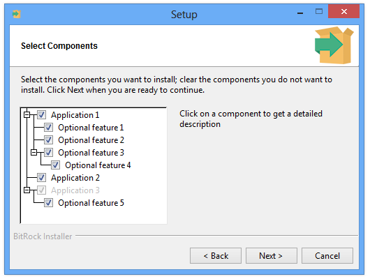
</project>Component groups are displayed as a tree in the component selection page, where the user may choose to install any subset of its sub-components.
The following image shows the component selection screen for the example above:
As with a regular component, a component group can include its own files (in its <folderList>) and actions.
Component groups may also be nested, creating multiple levels. This can be done by embedding a <componentGroup> in the <componentList> of another <componentGroup>. The feature4 component is an example of this - it is inside the feature3 <componentGroup>, which is a sub-component of application1.
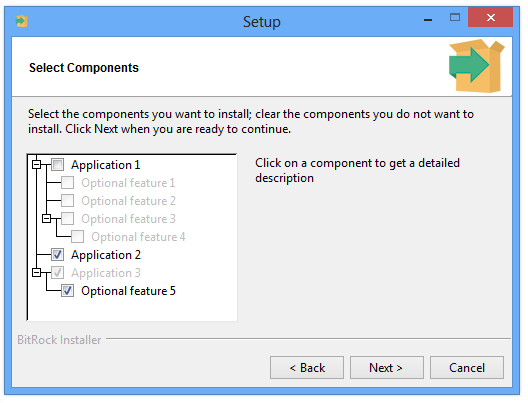
A child component will be installed only if it is selected and all of its parent component groups are selected as well. For example, if application1 is not selected, then regardless of whether or not feature1 was previously selected, it will not be installed. In the GUI component selection, this behavior is represented by visually deselecting all of the child components when deselecting a parent. For example, the following shows that when application1 is deselected, all of its child components are automatically deselected and cannot be edited:
Selecting a child component for installation requires enabling its parent components. In the example, in order to install feature1, the user first has to select application1 by clicking on the checkbox next to it. This will allow editing of the children of application1. Similarly, to enable feature4, the user needs to select both the application1 and feature3 component groups.
Specifying which components to enable from the command line differs in behavior. Whenever the user specifies --enable-components, all parents of specified components are also automatically selected. For example, if the user specifies that feature4 should be enabled, feature3 and application1 are automatically selected.
Installing in text mode
When running an installer in text mode, sub-components can only be chosen if a parent has been chosen. For example:
 $> /path/to/installer --mode text

...

Select the components you want to install; clear the components you do not want
to install. Click Next when you are ready to continue.

Application 1 [Y/n] :y

Application 1 - Optional feature 1 [Y/n] :y

Application 1 - Optional feature 2 [Y/n] :y

Application 1 - Optional feature 3 [Y/n] :n

Application 2 [Y/n] :y

Application 3 : Y (Cannot be edited)

Application 3 - Optional feature 5 [Y/n] :n

...
Please note that the user was not asked about feature4 since the feature3 component group was not selected.
As a regular parameter group, a <componentGroup> with its <show> property set to false won’t be visible, hidden its child as well.
If a <componentGroup> has its <canBeEdited> set to false but is selected by default, its sub-components can be still edited (if they individually allow it). However, in the case of a deselected component group that cannot be edited, their child won’t allow any user interaction, regardless of their individual configurations.
Downloadable components
InstallBuilder provides the ability to configure some or all of the available components to be separate, downloadable content instead of being embedded in the installer. This means that elements of the application that are not always used can be made downloadable to decrease an installer’s size.
Each downloadable component is built as a separate file for each platform. After building a project, its components should be copied to a web server or file hosting service so that users can download it.
How to create downloadable components
Any existing or new project can be configured to have its components downloadable as separate files.
To do so, enable the <downloadable> tag for any <component> in the project that should be made downloadable.
In addition, the <componentsUrl> should be a URL that points to the directory where all files are to be placed.
For example, the following is a complete project, including the URL where the components will be copied:
<project>
  <shortName>downloadabledemo</shortName>
  <version>1.0</version>
  <componentsUrl>http://example.com/installer/components/</componentsUrl>
  ...
  <componentList>
    <!-- component that should be embedded in the installer -->
    <component>
      <name>core</name>
      <description>Core features</description>
      ...
    </component>

    <!-- another component that should be embedded in the installer, specified explicitly -->
    <component>
      <name>osintegration</name>
      <downloadable>0</downloadable>
      <description>Integration with operating system</description>
      ...
    </component>

    <!-- another component that should be built as downloadable component -->
    <component>
      <name>optional</name>
      <downloadable>1</downloadable>
      <description>Optional content</description>
      ...
    </component>

  </componentList>
  ...
</project>
In order to build the project with downloadable components enabled, the --downloadable-components flag should be passed to the CLI.
$> path/to/bin/builder build project.xml linux --downloadable-componentsWhen using the GUI, the downloadable components checkbox should be enabled in the Build section before building the project.
After building the project for Linux, an additional directory downloadabledemo-1.0-components will be created with an optional-1.0-linux.pak file inside.
When a project contains more components or is built for other platforms, additional files will be created in this directory.
After building the project, all contents of this directory should be uploaded to a web server so that they are available at <componentsUrl>.
For the example above, the full URL should be http://example.com/installer/components/optional-1.0-linux.pak.
Some components may be available under different URLs. In this case, it is possible to specify the location using the <url> tag.
The example below shows how optional content can be placed at a different URL:
<project>
  ...
  <componentList>
    <!-- another component that should be built as downloadable component -->
    <component>
      <name>optional3rdparty</name>
      <downloadable>1</downloadable>
      <description>Optional content, provided by other vendor</description>
      <url>http://example.net/downloads/optional3rdparty-1.0-${platform_name}.pak</url>
      ...
    </component>
  </componentList>
  ...
</project>
The component above will be downloaded from a different website using different platform names.
It is also possible to configure the directory for outputting the components using the <componentsDirectory> tag.
This can be specified relatively. In this case it is relative to <outputDirectory>.
For example, to copy all component files into the same directory as <outputDirectory>, do the following:
<project>
  <componentsDirectory>.</componentsDirectory>
  ...
</project>
Running the installers with downloadable components
The behavior for installers with one or more downloadable components is the same as it is with regular installers.
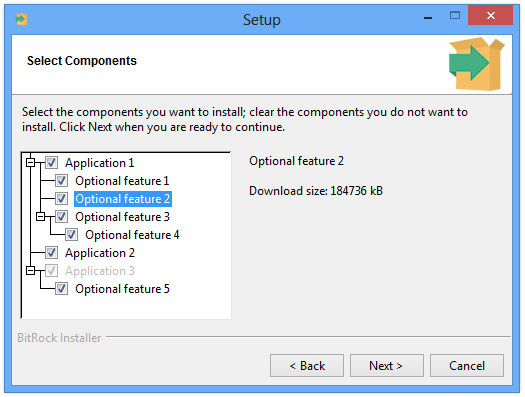
The component selection page shows the downloadable file size for each component available for download:
If a user does not select any downloadable component, the installer does not perform any download or show any additional information related to downloading components.
If a user does want to install a downloadable component, after the Ready To Install page is shown, the user is presented with a proxy configuration page:
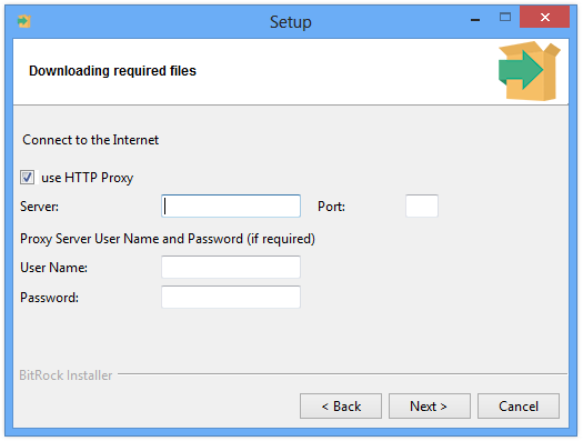
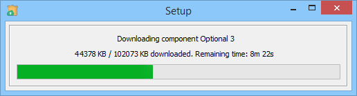
After the user configures or skips the proxy server configuration, the installer starts downloading the specified components:
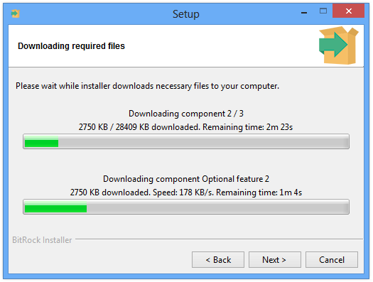
If no error occurs, the installation proceeds when all components are downloaded and no user interaction is required.
In the event of an error, the user is prompted with three options:
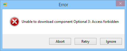
-
Retry- retry the download -
Ignore- do not attempt to download the current component and proceed without installing it -
Abort- abort installation
Handling errors
In the event of download errors, the user is able to ignore the fact that a component could not be downloaded and proceed with the installation. It is possible to define actions that should be run when a component failed to download and the user chose to ignore it. For example:
<project>
  <shortName>downloadabledemo</shortName>
  <version>1.0</version>
  <componentsUrl>http://example.com/installer/components/</componentsUrl>
  ...
  <componentList>
    <component>
      <name>php</name>
      <downloadable>1</downloadable>
      <description>PHP module for Apache</description>
      <onDownloadErrorActionList>
        <throwError>
          <text>PHP module is required for phpMyAdmin. Aborting installation</text>
          <ruleList>
            <isTrue>
              <value>${project.component(phpmyadmin).selected}</value>
            </isTrue>
          </ruleList>
        </throwError>
      </onDownloadErrorActionList>
    </component>

  </componentList>
  ...
</project>
In this case, if the PHP module is not downloaded and another component depends on it, the installation will abort.
Text mode and unattended installers
Text mode installers provide the same support for downloadable components as GUI installers. After all parameters have been specified and at least one component needs to be downloaded, the user is prompted with a proxy configuration question. The user may choose to skip proxy configuration or specify it.
Next, downloading begins and the overall progress of installation is shown (this is the same feedback provided in the form of a progress meter for GUI installations).
Unattended installers also provide support for downloadable components. Components are downloaded and installation occurs automatically.
If unattendedmodeui is specified as minimalWithDialogs, progress for downloads is shown only as the overall download progress.
Similar to GUI installers, when all components are downloaded, the installation proceeds.
Adding or removing components to existing installations
InstallBuilder offers the ability to install and uninstall individual components without reinstalling or uninstalling the entire application.
This functionality is disabled by default. In order to enable it, enable <allowAddRemoveComponents>.
Storing installation information
InstallBuilder stores the location of all applications inside of the application directory.
When performing an installation, the user specifies the directory where the application should be installed.
If <allowAddRemoveComponents> is enabled, a check is made to see if a previous installation
exists in specified directory before the component selection page is shown.
If it contains information about a previous installation, it is used by the installer. This information will consist of currently installed components and optionally for storing previous values for parameters that allow it.
It also contains information about the currently installed version. If the versions do not match, information about the currently selected components and values for parameters that allow it is used. However, all components are reinstalled in such a case.
Installing additional components
If <allowAddRemoveComponents> is enabled, the installer will automatically detect whenever a valid installation of the application is present in the installation directory.
Components previously installed will always be selected and the user will not be able to uninstall components using the installer. The user may choose to install additional components.
Whenever any change is made, all actions for newly selected components are run. However, actions for components previously installed are not run. This prevents actions that set up default values from overriding settings that user has already modified.
After a successful installation, the uninstaller and all related information will be updated to reflect that the user has installed additional components.
Uninstalling components
If <allowAddRemoveComponents> is enabled, running the uninstaller will show an additional choice page with the following options:
-
Entire application - removes the entire application and all files installed by the application
-
Individual components - removes individual components while leaving the rest of the application intact.
When a user selects the Entire application option, the behavior is the same as when <allowAddRemoveComponents> is disabled.
When a user selects Individual components, a component selection page will be shown. All components not currently installed will not be shown in the component selection tree.
Components that have their <canBeEdited> disabled will not be editable.
When a user selects a component group, the component and all of its sub-components will be removed.
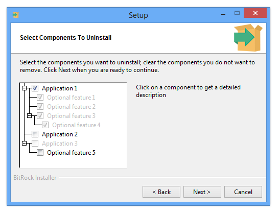
For example if a user selects application1, this causes feature1, feature2, feature3 and feature4 to be uninstalled:
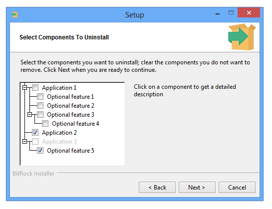
Selecting a component group to be uninstalled also causes all of its child components to be uninstalled. Those components are shown as selected and cannot be edited. For example the following shows that the component application1 will be uninstalled, which will also cause all of its child components to be uninstalled:
If a parent is deselected, the selection of its children is reverted - if a child component was previously explicitly selected before selecting the parent, it will remain selected. Otherwise the child component will be deselected.
When a user selects all of the components, the installer will behave as if the Entire application option was chosen. Otherwise, selected components will be removed and pre- and post- uninstallation actions for these components will be run. Remaining components will remain installed and no actions for these components will be run.
After successful uninstallation, the uninstaller and all related information will be updated to reflect that the user has uninstalled some of the components.
When the Entire application option is chosen or the user selects all components in the component tree, the entire application is uninstalled along with uninstaller itself. This also triggers pre- and post- uninstallation actions for the project to be run.